Brand metamorphoses: The evolution of iconic logos
In the vibrant universe of branding, logos are much more than just images; they are the values and the promise to the consumer.
A logo redesign is not a superficial aesthetic decision, but a profound strategy that seeks to revitalise a brand's image, adapt it to new trends and connect with audiences more effectively.
In Anagraf, we explored the transformative power of redesigns, considering not only form and colourbut also the texture and special finishes such as foils and inks, that throughout history have added a distinctive touch to the most iconic brands.
Apple: From complexity to minimalist essence
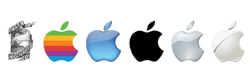
The journey of the Apple logo is a paradigmatic example of the evolution towards simplicity. From the initial depiction of Isaac Newton under an apple tree, to the iconic bitten apple in rainbow colours, the Apple logo has always been synonymous with innovation.
In the early days, logo printing often included special metallic inks to give it a premium look.
With the transition to minimalism and the monochromatic apple, the door was opened to experimentation with different finishes, such as ehe aluminium engraving of its products, which evokes sophistication and precision.
Nike: The power of a swoosh and the vibrancy of colour
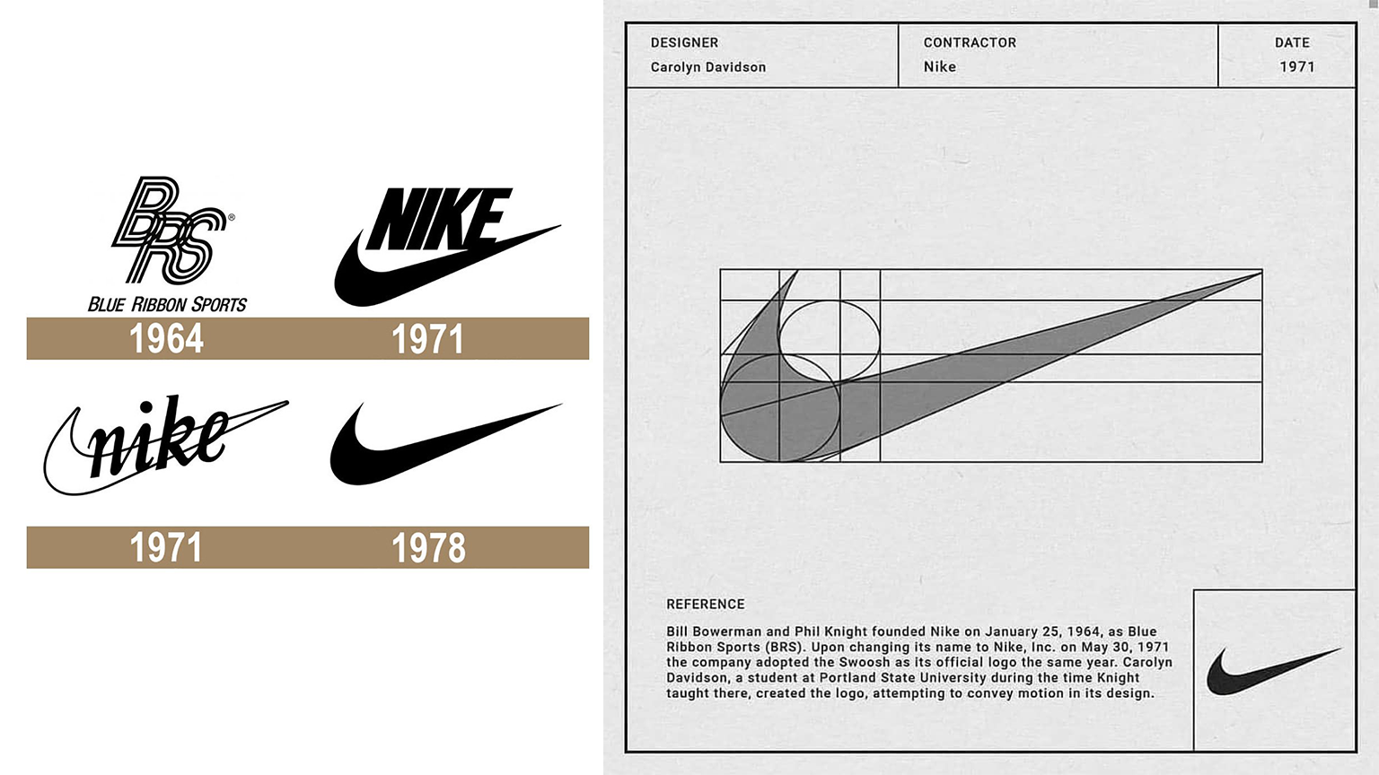
The Nike swoosh is more than a logo; it is a symbol of movement, speed and achievement.
Created by Carolyn Davidson, this symbol has transcended its original function to become a cultural icon.
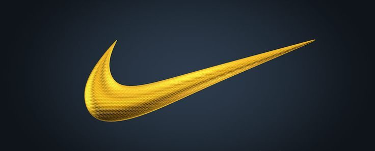
Over the years, Nike has played with a wide range of inks, from vibrant colours and neon to catch the eye, to more sober and elegant tones.
The application of foils, especially in special editions of trainers and sportswear, adds a touch of exclusivity and luxury to the brand.
McDonald's: The golden arches, shiny in foil and ink
McDonald's golden arches are instantly recognisable in every corner of the globe. They represent the promise of a familiar, fast and affordable experience.
The use of gold inks, often with a slight metallic sheen, has always been a constant feature in the history of the logo, evoking warmth and joy.
In advertising campaigns and promotional materials, the application of gold foil further enhances the iconicity of the arches, creating a memorable visual impact.
Google: The simplicity of chromatic diversity
The Google logo, with its vibrant colours and friendly typography, has always conveyed accessibility and dynamism.
The choice of flat and bright inks reinforces the joy and simplicity of the brand.
Although the use of foils has not been a prominent feature in its main logo, Google has explored different finishes and textures in its products and marketing materials, demonstrating its ability to innovate and adapt.

Conclusion: The alchemy of design
These logo redesigns demonstrate that evolution is essential to stay relevant in an ever-changing world.
The choice of inks, the application of foils and the exploration of different textures and finishes are key elements that contribute to building a strong and memorable brand identity.
At Anagraf, we understand the importance of a strategic design that captures the essence of a brand and projects it into the future. If you are considering a redesign of your logo, contact us.
Together, we can create an image that tells your story and connects you with your audience in a meaningful way.

