The power of colour: How it influences the mind of your customer and the perception of your brand.
When you see a light blue, you feel calm. When you see a bright red, the feeling you get is one of alertness. Right?
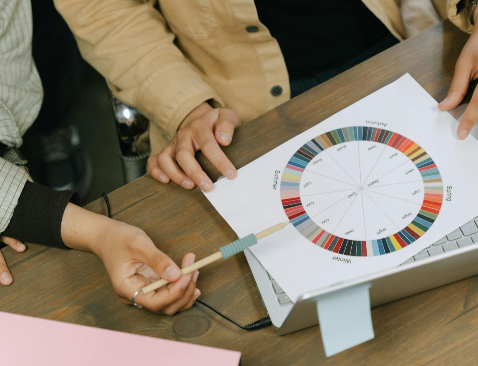
It is no coincidence that we all experience this perception in the same way. It has a key scientific explanation: the neurology of colour.
Colour has the ability to trigger emotions, memories and reactions in a matter of seconds.
In the world of graphic design, understanding this connection between colour and psychology is key to creating pieces that don't just look good, but to communicate powerfully.
Colour: An invisible language
Our mind is able to interpret colour before any shape or word.
Your customer only needs 90 seconds to get a perception of your brand. And 90% of that perception is produced by your company's corporate colour.
Each tone activates different areas of the brain, which influences the mood of your customer and generates an interpretation of your brand that will stay with them for life.
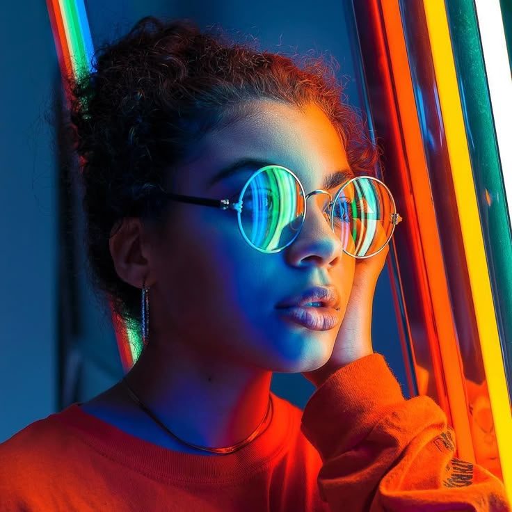
What does each colour convey?
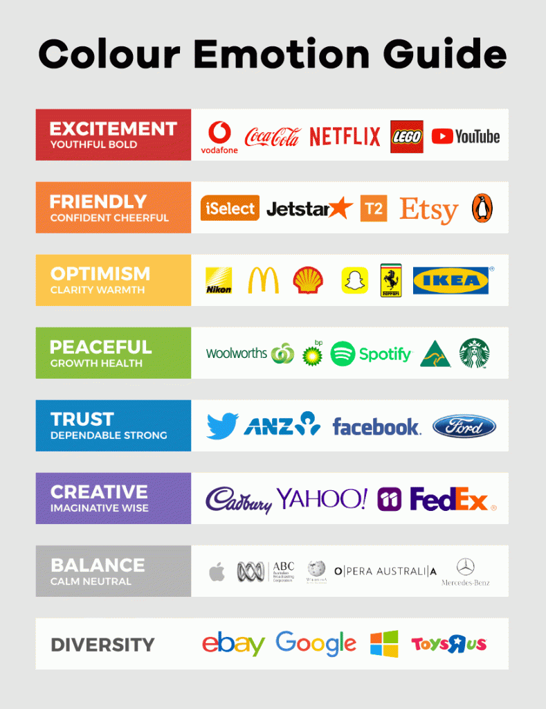
Red: Activates the pulse, generates energy, passion, dynamism. Ideal to provoke an immediate reaction.
Orange: Evokes friendliness, trust and confidence. Second chances.
Yellow: It awakens creativity, generates optimism and closeness.
Green: It is linked to nature, wellbeing, balance... Ideal for sustainable or health brands.
Blue: It conveys security, stability, professionalism. That is why it is so widely used by banks and technology companies.
Purple: It is related to spirituality, modernity and originality. It also conveys peace and illusion.
Gold and metallic: It is associated with luxury, value and excellence.
White: Diversity, freedom, purity, calm, confidence.
Your brand does not enter through the eyes, it enters through the brain.
At Anagraf we know it well: colour is not just an aesthetic choice. It is also a strategy.
We work exclusively with the following inks T&K TOKA, The colours are world-renowned for their chromatic purity and their ability to reproduce intense and vibrant colours.
The way we create impact is not just about the colour, but how we make it shine.
Our secret? Use varnishes, metallic prints and other graphic finishes to transform a good print into a sensory experience.
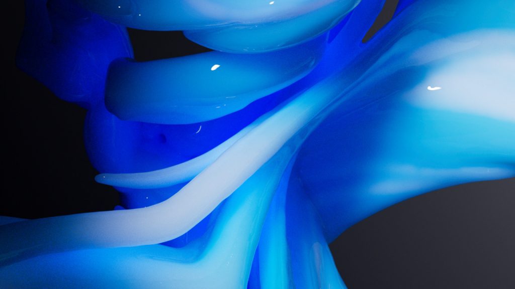
An intense blue combined with a high gloss varnish, is like looking at the bottom of the ocean. The client will feel that sense of vastness, freedom and excitement in just 90 seconds.
On the other hand, a matt black with gold details on the stamping will make a packaging speak for itself and say: "Yes, I am a luxury. You should buy me"
How does your brand dress? Psychology, design and finishing
Colour connects us with emotion. And in graphic design, emotion is the first step towards action: look, remember, desire, buy.
That is why, when planning a graphic piece, it is not only a question of "what colour looks good"but what you want to provoke: confidence, desire, serenity, urgency, closeness?
The right colour, applied with a quality ink and reinforced with a well-chosen finish, can turn a printed piece into a sensory extension of the brand.

